
Your website or mobile app might be the reason you’re losing customers, and you may not even realize it. Every day, visitors and app users land on business platforms with real intent to buy, book, or sign up, only to abandon the experience within seconds because of small, fixable problems. If your traffic looks healthy but your conversions don’t match up, one (or several) of these common mistakes in web and mobile app development could be to blame.
The frustrating part is that most businesses never find out. A user doesn’t call to complain that your app was slow or your site was confusing; they simply leave, and you never see the missed opportunity in your analytics. All you see is a bounce rate that seems a little high, a checkout flow with drop-offs, or an app uninstall rate that’s higher than it should be. The real cost hides in plain sight.
Below are seven of the most common and costly mistakes in web and mobile application development, why they happen, and how a professional web and mobile app development agency approaches fixing them.
1. Slow Load Times and Poor App Performance
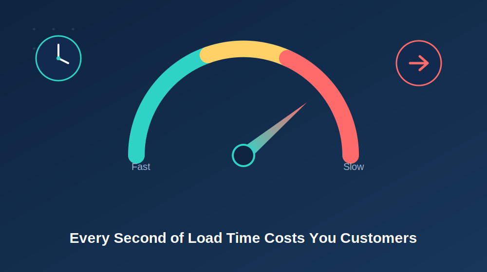
Speed is the silent deal-breaker, whether you’re running a website or a native mobile app. Research consistently shows that a delay of even one to three seconds can cause a significant jump in bounce rate on the web. On mobile, slow-loading screens or laggy interactions are one of the top reasons users uninstall an app within the first week.
This mistake often creeps in gradually. A business adds a new plugin here, an oversized hero image there, an unoptimized API call somewhere in the mobile app’s backend, and six months later, what used to load instantly now takes several seconds. Nobody notices because nobody is watching a stopwatch. Users are simply leaving a little more often, and the business has no idea why.
Performance also affects more than user patience. Search engines factor page speed into their ranking algorithms for web platforms, and app stores factor crash rates, load times, and responsiveness into how prominently an app is featured. A slow experience doesn’t just lose the customers who show up; it shows up less often in the first place.
Fix it: Compress images and assets before deployment, minimize unnecessary scripts and third-party plugins, use a content delivery network (CDN) for web platforms, and optimize API calls and database queries for mobile applications. Test performance regularly with tools like Google PageSpeed Insights, Lighthouse, or Firebase Performance Monitoring for mobile apps.
2. Confusing Navigation and Poor Information Architecture
If users can’t find what they’re looking for within a few taps or clicks — whether on a responsive website
or a mobile app — they’ll leave. Overloaded menus, unclear labels, and inconsistent structure force people
to work harder than they should just to understand what you offer.
This mistake often comes from good intentions. A business wants to showcase everything it does, so the
navigation grows to include a dozen dropdown items, nested menus, or app screens that feel more like a
filing cabinet than a guide. In mobile app development specifically, cramming too many features into a
bottom navigation bar or burying key actions inside multiple layers of menus is a fast way to frustrate
users who expect quick, intuitive access.
Think about the difference between a menu item labeled “Solutions Ecosystem” versus one labeled simply
“Services.” The first requires interpretation; the second tells the user exactly what they’ll find. Every extra
second of interpretation — on web or mobile — is a chance for someone to give up and leave.
Fix it: Keep your main navigation to 5–7 items, use clear and familiar labels instead of internal branding language, and make sure your most important pages or screens are never more than two taps or clicks away. For mobile apps, follow platform-native UX patterns (iOS Human Interface Guidelines and Android Material Design) so navigation feels familiar rather than forcing users to learn something new.
3. No Clear Call-to-Action
A website or app without an obvious next step is one that leaks customers. If users have to guess whether
they should call, sign up, book, or buy, most of them simply won’t take any action at all. This is one of the
most common — and most fixable — mistakes in both web and mobile app design, because it usually isn’t
about visual design. It’s about clarity.
Many platforms make the mistake of treating every button with equal visual weight, or worse, offering no
clear action at all. A homepage or app home screen might communicate a lot about a company’s value
proposition but never actually ask the user to do anything. People rarely take initiative on their own; they
need to be told, clearly and confidently, what to do next.
There’s a psychological element here too. A strong, singular call-to-action reduces decision fatigue. When
users are given five equally weighted options, they often choose none of them, simply because deciding
feels like effort. One dominant, well-placed action performs far better — both on a webpage and inside an
app’s user flow.
Fix it: Every page or screen should have one clear, prominent call-to-action — “Get a Free Quote,” “Book a Consultation,” “Start Free Trial,” “Sign Up” — that stands out visually and tells users exactly what to do next. Repeat that same call-to-action at logical points throughout longer pages or multi-step app flows, and use action-oriented button copy rather than something passive like “Submit.”
4. Not Optimized for Mobile — Or Not a True Native Experience
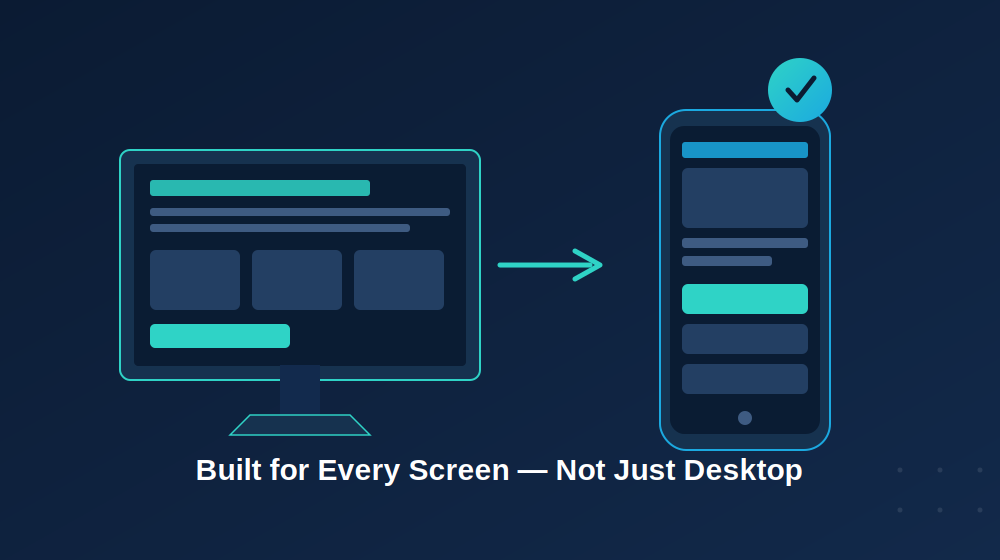
More than half of web traffic now comes from mobile devices, and for many businesses, a growing share of engagement happens through a dedicated app rather than a browser at all. If your website is hard to read or tap on a phone, or your mobile app feels clunky, non-native, or inconsistent across iOS and Android, you’re alienating the majority of your potential customers before they even experience what you offer.
A site or app that isn’t truly optimized for mobile often shows up in small but frustrating ways: text requiring a pinch to zoom, buttons placed too close together, forms that are painful to complete with a thumb, or a mobile app built on a generic cross-platform template that doesn’t feel native to either operating system. None of these issues are dealbreakers on their own, but together they create an experience that feels unpolished, and unpolished reads as untrustworthy.
It’s also worth noting that “mobile-friendly” and “responsive” aren’t the same as “well-designed mobile app.” A responsive website adjusts its layout to fit different screen sizes, but a genuinely good mobile experience, whether in a browser or a dedicated app, also considers tap target size, load speed on cellular connections, offline behavior, and how much effort is required to complete key actions like checkout or sign-up.
Fix it: Use responsive design for web, and invest in proper native or high-quality cross-platform mobile app development rather than cutting corners with a generic template. Test on real devices, not just a browser’s resize tool, and pay close attention to your checkout, booking, or sign-up flow specifically, since that’s often where mobile users abandon the experience entirely.
5. Outdated or Generic Content
Stock photos, vague copy, and content that hasn’t been updated in years signal one thing to visitors: this business isn’t paying attention. Trust is hard to build and easy to lose, and outdated content erodes it fast, whether it’s sitting on your homepage or inside your app’s onboarding screens.
Consider what it communicates when a “Latest News” section hasn’t been updated in years, an app’s changelog shows no recent updates, or a team page still lists an employee who left the company long ago. Even if the core product is excellent, small details like these plant a seed of doubt. If a business can’t keep its own platform current, a visitor might reasonably wonder what else is being overlooked, including security updates for a mobile app.
Generic stock photography carries a similar cost, even if it’s less consciously noticed. Visitors have seen the same smiling businesspeople and handshake photos across hundreds of websites, and on some level, it registers as filler rather than substance. Real photos and real product screenshots do more to build credibility in seconds than paragraphs of copy ever could.
Fix it: Refresh your copy to speak directly to your customers’ problems rather than describing your company in the abstract, use real photos of your team, product, or app interface, and review key pages and app store listings at least twice a year. Push regular app updates, even minor ones, since an actively maintained app also signals reliability and ongoing security support to users.
6. Hidden or Complicated Contact Information
If a user is ready to reach out and can’t easily find a phone number, email, or in-app support option, you’ve lost a warm lead. Burying this information in a footer link, behind multiple taps, or inside an unhelpful FAQ bot is a common and costly mistake, because it punishes exactly the users who are closest to becoming customers.
This mistake is particularly costly because it targets your highest-intent traffic. Someone browsing your blog casually is different from someone who has already decided they want to work with you and is actively looking for a way to get in touch, whether through your website or your app. Making that person hunt for a phone number, dig through a footer, or navigate multiple in-app menus with no clear expectation of a response time is a great way to lose a sale you’d already essentially won.
Fix it: Put your contact information in your website header or a visible app menu item so it’s accessible from every screen, and consider adding a simple, short contact form or in-app support chat that’s easy to find. If you rely on phone calls, make your number clickable on mobile so users can call with a single tap instead of copying and pasting it.
7. No Trust Signals
New visitors and app users are naturally skeptical. Without reviews, testimonials, certifications, or clear proof that real customers trust you, people are far less likely to convert, especially for higher-consideration purchases, subscriptions, or apps that require account creation and personal data.
Trust signals work because they answer an unspoken question every user has: “Can I actually rely on this business?” Claims a company makes about itself are useful, but inherently biased. What people actually trust is evidence from others: star ratings, specific testimonials, case studies with real results, industry certifications, or recognizable client logos. For mobile apps specifically, App Store and Google Play ratings carry enormous weight in the download decision itself.
The absence of these signals doesn’t necessarily make someone think a business is bad. More often, it just adds a small amount of hesitation, enough for them to think “I’ll look around a bit more” instead of committing right away. And in that moment of hesitation, a competitor’s app or website is often just one tab away.
Fix it: Add customer testimonials, case studies, star ratings, client logos, or industry certifications prominently on your homepage, service pages, and app store listing, not buried on a separate page. Actively encourage satisfied users to leave app store reviews, since ratings volume and recency directly influence how your app ranks in search results within the App Store and Google Play.
The Bottom Line
Most lost customers don’t leave because they didn’t like your product or service; they leave because your website or app made it too hard to say yes. Slow performance, confusing navigation, a missing call-to-action, a poor mobile experience, outdated content, hidden contact information, or a lack of trust signals can each quietly chip away at your conversions, and most businesses have more than one of these at play at the same time, across both their web and mobile platforms.
The good news is that every mistake on this list is fixable, often without a full rebuild. Small, targeted improvements to your web and mobile app development strategy can have an outsized impact on how many visitors and users actually turn into customers.
If you’re not sure which of these issues might be affecting your website or app, a fresh set of eyes can make all the difference. At Triogency, we specialize in custom web and mobile application development that’s built to convert, not just platforms that look good but sit and wait. From performance audits to full-scale rebuilds, we help businesses turn their digital products into tools that actually grow revenue.
Ready to find out what might be costing you customers? Let’s talk.
Ready to find out what might be costing you customers? Let’s talk.